Understanding White Balance
White Balance affects how a photograph renders color and atmosphere. This article explains what White Balance is, how to use it in the camera, and how to fine-tune it in post-processing to achieve natural and consistent results.
How to control color and atmosphere in your photographs
White Balance is one of those camera settings that many photographers leave on Auto and rarely question. Modern cameras do a decent job most of the time, yet White Balance quietly shapes how a photograph feels. It decides whether a scene looks warm or cold, natural or artificial, inviting or flat.
Understanding White Balance is not about chasing perfect neutrality. It is about learning how light behaves and how to translate what you see into a believable and intentional image.
What White Balance really is
White Balance describes how a camera interprets the color of light. Every light source has its own color temperature. Morning and evening light are warm, while overcast skies and shade appear cooler. Artificial light sources such as tungsten bulbs and LED lamps have their own distinct color characteristics.
Our eyes adapt automatically. A white wall looks white to us whether we stand outside at noon or indoors in the evening. A camera does not adapt on its own and needs to be told what white should look like.
Color temperature is measured in Kelvin and describes the visual warmth or coolness of light. Lower Kelvin values correspond to warmer light, while higher values describe cooler light. In photography, White Balance compensates for this color shift, allowing the scene to appear natural and believable rather than technically neutral.
Kelvin is a physical unit of temperature used to describe the color of light based on how hot an ideal light source would be. In photography, it helps translate light color into White Balance settings.
Why White Balance matters
White Balance affects more than technical accuracy. It influences mood, atmosphere, and how believable a photograph feels.
A portrait with incorrect White Balance can make skin tones look unhealthy. An interior scene can lose its evening warmth. A landscape can feel colder than the moment actually was.
White Balance is not just correction. It is interpretation.
Using White Balance in the camera
Auto White Balance
Auto White Balance is convenient and often reliable, especially in changing light. Its main limitation is that it reacts to each scene independently and tries to neutralize the dominant color cast. Warm evening light can be cooled down, while indoor scenes lit by LEDs may look flatter than they felt in reality. Auto White Balance works well as a starting point, but it should not always be trusted as the final decision.
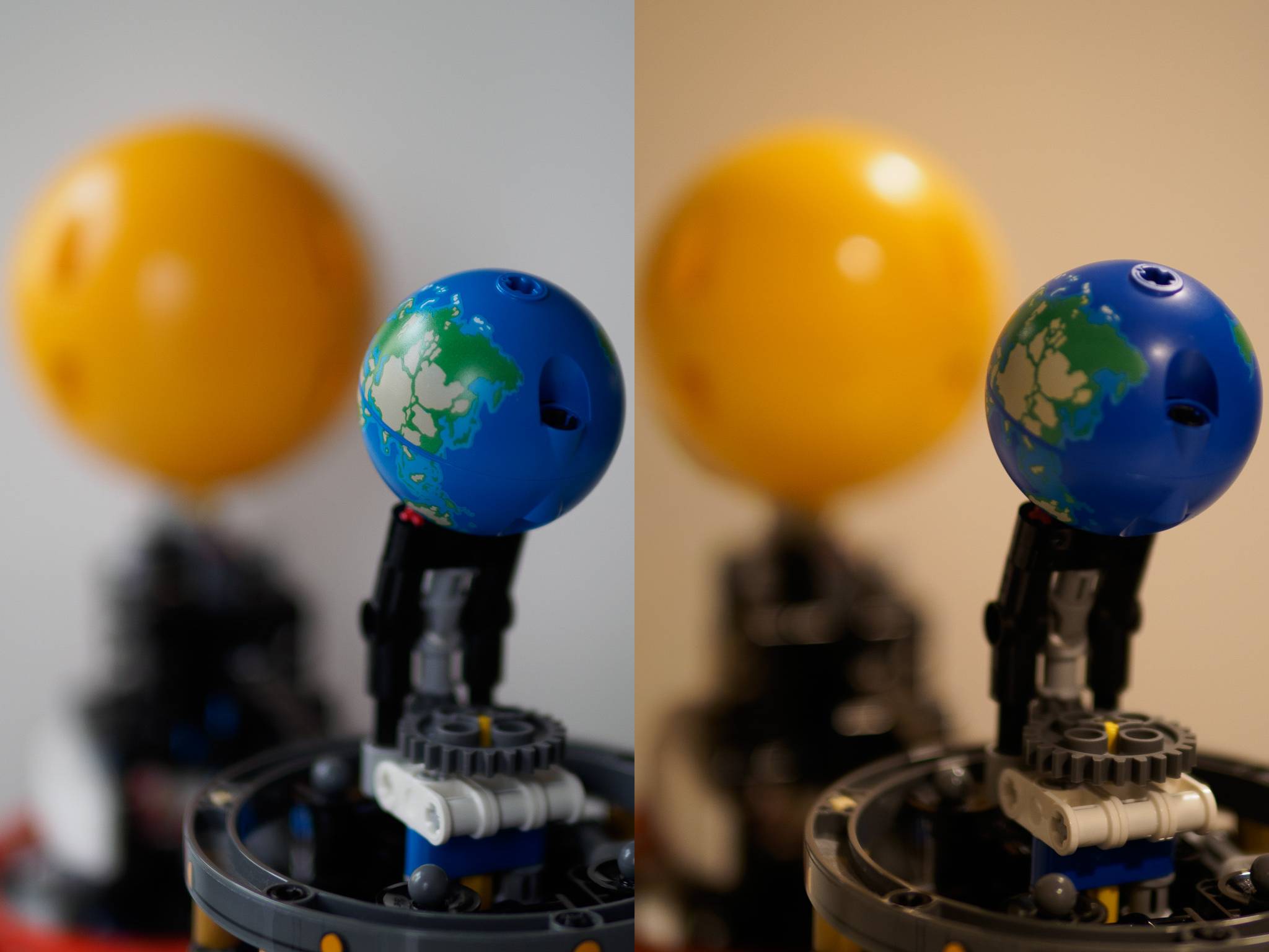
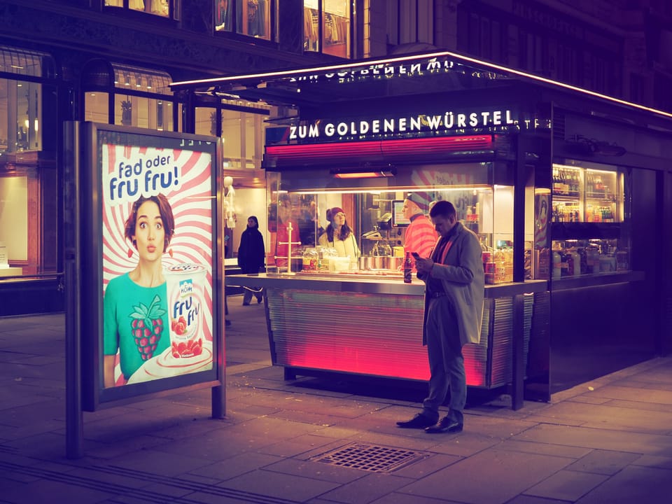
Both halves show the same scene photographed with Auto White Balance. The left image was taken in overcast daylight, and the right image was taken indoors under LED lighting. Different light sources produced noticeably different color rendering, with Lightroom adjusting white balance to about 5250 K for daylight and 3450 K for LED lighting. This demonstrates that Auto White Balance adapts to each scene, but does not ensure consistent colors across different lighting conditions, making manual adjustment or post processing important.
Preset White Balance modes
Presets such as Daylight, Cloudy, Shade, or Tungsten give the camera a clearer idea of the light source. They are more consistent than Auto WB, but still approximate.
They work well when the lighting situation is obvious and stable.
Common White Balance presets and their typical color temperatures
| White Balance preset | Approximate Kelvin value | Typical use case |
|---|---|---|
| Auto WB | Variable | General shooting in mixed or changing light |
| Tungsten | 3000–3200 K | Incandescent bulbs, warm indoor lighting |
| LED | 3300–4000 K | Modern LED indoor lighting |
| Fluorescent | 3800–4200 K | Older fluorescent lighting |
| Daylight | 5200–5500 K | Direct sunlight, clear daytime scenes |
| Flash | 5400–5600 K | On-camera or studio flash |
| Cloudy | 6000–6500 K | Overcast conditions, softer daylight |
| Shade | 7000–7500 K | Deep shade, strong blue cast compensation |
Manual Kelvin settings
Setting White Balance manually using Kelvin values offers the most control. You decide how warm or cool the scene should appear.
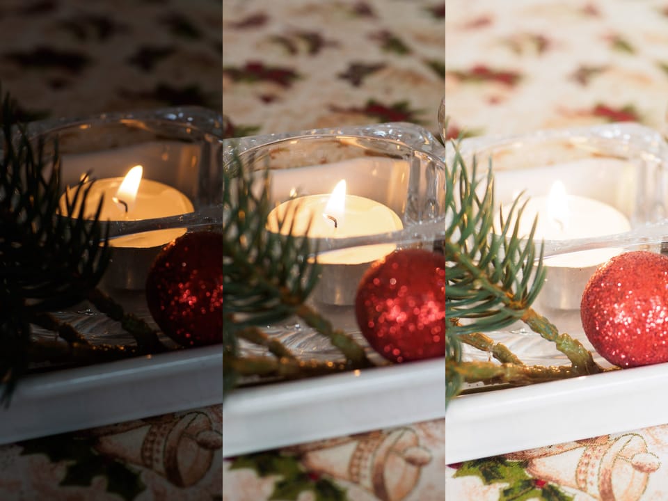
As an example, evening interiors lit by modern LED bulbs often look most natural between 3300 and 3500 Kelvin. Auto White Balance may push the image closer to 3800 or 4000 Kelvin, which can feel slightly cold compared to the real atmosphere.
Custom White Balance
For controlled situations such as studio work or product photography, a custom White Balance measured from a neutral surface provides the most accurate results. This approach is less practical for everyday shooting but extremely precise.
The ColorChecker Passport helps set a consistent custom White Balance in controlled lighting.
Recommended White Balance settings for specific situations
Certain photographic situations benefit greatly from a fixed White Balance rather than automatic adjustment. In these cases, setting a manual Kelvin value helps maintain consistency, preserve atmosphere, and simplify post-processing
| Situation | Recommended Kelvin |
|---|---|
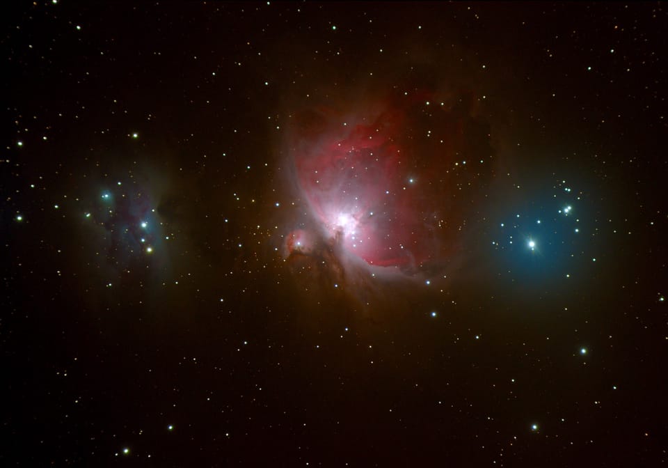
| Night sky and astrophotography | 3500–4000 K |
| Indoor LED lighting | 3300–3600 K |
| Mixed indoor lighting | 3600–4200 K |
| Studio lighting and flash | 5200–5600 K |
| Product and macro photography | 5000–5500 K |
| Panorama, focus stacking, time lapse | Fixed value matching the scene |
White Balance in post-processing
Shooting in RAW gives you full flexibility. White Balance is not baked into the file and can be adjusted freely without quality loss.
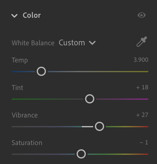
The Temperature slider
In Lightroom and similar editors, the Temperature slider follows a simple rule. Moving it left makes the image cooler. Moving it right makes the image warmer.
When you lower the value from around 3900 Kelvin to 3400 Kelvin, you are telling the software that the original light was warmer than expected. The editor compensates by adding blue and reducing yellow.
Lower Kelvin values often make images appear brighter. This is a perceptual effect rather than a change in exposure.
The Tint slider
With LED lighting, Tint is often just as important as Temperature. Many LEDs introduce a subtle green or magenta cast. Small adjustments here can dramatically improve skin tones and neutral surfaces.
It is common that a slight Tint correction has more impact than a large change in Kelvin.
How to judge the result
Focus on skin tones, white surfaces, and the overall feel of the scene. Whites do not need to be perfectly neutral, especially in evening light. A slight warmth often feels more honest than technical correctness.
If the image looks believable and matches your memory of the moment, the White Balance is doing its job.
A simple and effective workflow
- Shoot in RAW
- Use Auto White Balance or a rough Kelvin value in the camera
- Fine tune White Balance during post-processing
- Trust your perception rather than fixed numbers
There is no universally correct White Balance. There is only the balance that best represents the light and the mood you experienced.
Final thoughts
White Balance is one of the most powerful tools for shaping the emotional tone of a photograph. Once you understand how it works, you stop fighting color casts and start making conscious decisions.
Photography is not about neutralizing the world. It is about translating how it felt.